La Copa: Football Analysis Illustrated

How Spain beat Germany
For most of history, soccer has been fueled by passion and ambiguous calls rather than the statistics and absolute precision common in other sports.

Numbers alone don’t mean much in soccer from game to game. The number of goals, assists, foul, saves matter more in the span of a season or an entire career. However, analysis is not completely irrelevant or uninteresting. It just needs a graphic element as the NYTimes knows oh so well. They love infographics as much as words there.

The NYTimes live blog of World Cup matches includes four minute-by-minute graphics. Below are clips from the 17th minute of the Spain-Germany match.

The Line-Up
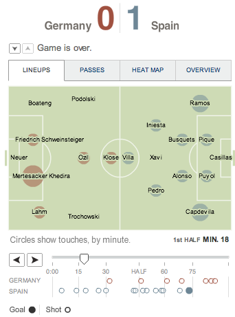
Based on amount of times a player touches the ball. Nearly the entire Spanish team touches the ball while only 5 Germans make contact.

The Passes
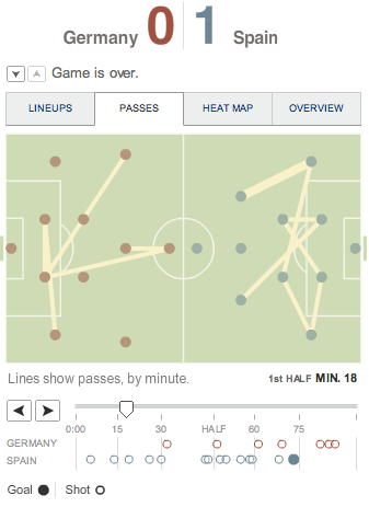
Lines connecting players by their passes. Look at the density of Spain's passes compared to Germany's.

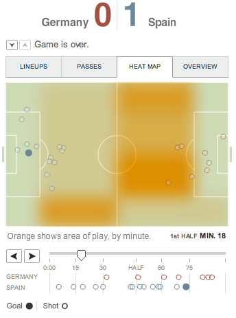
The Heat Map

Where the ball is on the field. Spain safely keeps possession in their half.

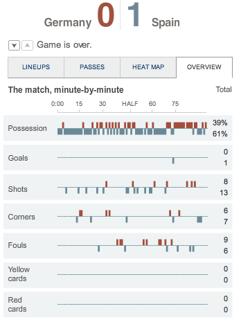
General Stats

What numbers alone cannot describe is the rhythm of the game revealed over time. (Rhythm is so crucial in soccer which is way video replays cannot be implemented the way it is in football which is not to say not at all, but it is a slippery slope....)

See the Spain’s dominant possession, but the game breaks a little before the half. Then see how Spain allows Germany to take the ball after they score the goal. Also, this match was probably the least controversial in the entire World Cup. No yellow cards and the first foul isn’t called until the 30th minute.

Statistics and more statistics makes statistics seem important.
This is even better:
The possession of all the games in the World Cup broken down. And at the bottom, breakdown of Americas versus Europe and the Dutch versus the Spanish.

Cristiano Ronaldo is the most popular soccer player in the world
Given our world in the age of social networking, opinion sharing, data mining, this interactive graphic is the best one of the entire tournament.

The NYTimes tallies day-by-day all the names of soccer players mentioned in updates, statuses, notes, comments on Facebook. The image of the soccer player is then sized accordingly. Scroll through the days and watch them change (see link above)!

Cristiano Ronaldo’s looming figure throughout the tournament seems to confirm his place as the most popular soccer player in the world or just the one that teenage girls find most attractive?
La Copa: Parte 2

The Holland – Brazil match today left us all wanting for some more jogo bonito (in the first half) and complete football (in the second half). Finally, there were the inspired moments of brilliant passing and fluid plays from two teams that are expected to do so every time they step on the pitch.

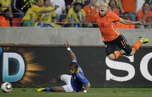
Despite playing their best halves of the tournament so far, they both managed to be needlessly irritating. Who was more obnoxious depends only on who side you were on. Robinho turned into a cursing machine who went off anytime Arjen Robben went down. Robben ended up on the floor clutching some random part of his body every time a Brazilian approached him at a crucial moment.

Robinho, yelling his head off for the nth time during the match.

Despite my penchant for balding midfielders with their hair shaved off (like Zidane), Robben has proven himself to be worse than Cristiano in his early years. While Cristiano sat on the ground like a helpless 3 year-old, Robben falls dramatically with arms failing followed by punching the ground with his fist as if in great pain. Perhaps he took this intensive one day course.

Robben's reaction after the Brazilian defender failed to make contact.

The worse heartbreak in soccer is when a genuinely brilliant player consistently cheats the game. Luckily, before I lost all hope, Sarah sent me this Nike commercial from 2002. It features the chicken dance move, the scorpion move, Ronaldihno with better hair, and all-around soccer merriment.

La Copa: Parte 1

The uninspiring commercials
Nike’s “Write the Future” campaign this World Cup has been its most embarrasing series of soccer commercials produced in the last 8 years. Plenty has written already written about the unfortunate fates of the soccer players featured in the video like Cannavaro, who led the worst Italian defensive squad in decades and Rooney, the English goal-scoring machine who barely made a few shots on goal and most surprising of all, Ronaldihno who did not even make the cut for the Brazilian squad.

But the real crime is the commercials’ inability to capture anything related to the spirit of the beautiful game. The ad sequences go like this: footballer on the field at some crucial moment in the game, then flashes to a footballer at a red carpet event, exercise DVDs based on the footballers’ moves, bigger-than-life statues unveiled in their hometowns, then ends with ‘write the future’ and the nike swoosh.

2010 Nike Commerial
The Cannavaro part with half dressed dancers and singer is the most disturbing….

Why is more than half the commercial about stardom and celebrity? Do we play soccer now for money and perks, hoping for a sponsorship from Nike? The implication seems to be that the resulting stardom is more important than the plays on the field. I am not inspired.

What happened to those commercials from 2006 with Eric Cantona, former Manchester United star, yelling about the beautiful, sacred game and the shame of diving and embellishing? Or the 2002 commercials in the Nike Cage when footballers showed off their most inventive moves in 3 on 3 games?

2006 Nike Commercial

Adidas has produced commercials even more off the mark in their collaborations with Star Wars. It may be slightly amusing to see soccer players with aliens but what is in there about soccer besides a famous face?

Their 2006 campaign featured two kids naming Zidane, Kaka, Beckenbauer and the like to play on their pick-up teams. It captured beautifully a sweet and innocent passion for the game and our secret fantasies of playing alongside the legends of soccer.

2006 Adidas Commercial

What is perhaps the saddest is that Hyundai, a car company, has outdone Nike and Adidas in capturing our sweet, simplistic and undying loyalty to soccer. Ai yai yai…..

Hyundai 2010 Commercial

social media for lazy ones

Those of us who can’t keep with one blog start even more sites that we need to update and convince ourselves that is somehow necessary.

So from the inmexico wordpress grows the inmexico tumblr. You may not be convinced that is necessary, but it really is. I need a place to digest my fashion blog consumption and catalog the hundreds of photos on my hard drive saved from blogs and runway shows. Yes, totally essential to my life.

(Tumblr is the true lazy man’s blog. It is made for 21st century immediate gratification. For one, you don’t even have to try to make it look nice.)

venice revisited

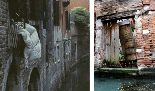
For several reasons, I have been consistently falling into daydreams about Venice in the past few weeks. One reason is the smell of warm weather which reminds of me the anticipation of going to Veneto last spring.  Another is a square two inch picture of a comforter laid on a window sill over a canal in Venice which I spotted while skimming a book for thesis. I immediately remembered that I had taken a picture across the same canal.  You can reach it by walking down a bright, wide but quiet street with a brick wall on one side and houses on the other. The street ends under a building next to the canal with no steps leading down to the water.

Left, picture from the book Collapsibles. I sat just beyond the picture on the right side of the canal across from the one-story high wall. Right, my photo of the one-story high wall.

Venice, despite its winding streets and consistent architecture, manages to remain distinct from street to street. In contrast, suburbia developers, who have constructed endless winding streets and incredibly consistent architecture, have created repetition and anonymity. (Maybe the new urbanists have done better?)  Venice succeeds in creating a sense of place and identity because it has much more variety than surburbia (obviously), not just in color or materials, but also (more importantly) in architectural forms/spaces. This is achieved through a lack of standardized street dimensions, organic growth, layers of uses, and layers of time amongst other things that I have yet to unravel.

I would love diagram/catalog Venice to dissect its spatial patterns, but that would be a self-torture as well. The question really is if I go back to Venice again (the dream…), how do I want to study it now that I have an intuitive grasp of it? What are the forms and patterns of Venice that be applied elsewhere and how does that translation happen? (I want the diagram of Venice somehow. This paragraph also makes me think that I have been brainwashed by MIT. Do I really need the diagram? I feel like there must be something that is between the diagram and J Wampler.)

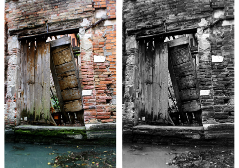
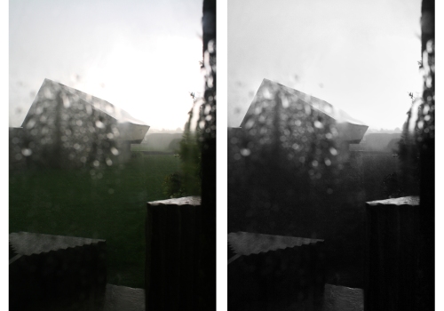
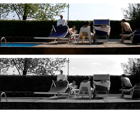
In any case, another reason for Venice daydreaming is wanting to edit the photos from the trip using my new skills from darkroom. Darkroom printing has made me conscious of the level of manipulation and control possible in a photograph which in turn makes Photoshop more fun (partially because digital is so much faster). Also, I am curious about the emotional difference of a black and white photo and a color one.  Some experiments of color and b/w below and flickr for more.

It looks old and full of character in color, but in black and white it is battered and used up.

rainy to moody, dark, and mysterious

cute pool party to glamorous gathering

blank pages

In the middle of a bad day next last week, I indulged in spending 26 dollars on a new Lechtturm notebook (not like Moleskines) that I justified by saying it was for my thesis. Buying a pair of boots would probably have been more therapeutic than a notebook, but the chances were low that I would actually find a pair of interesting boots and a level of itching excitement derived from the fresh pages of a new notebook is always guaranteed.

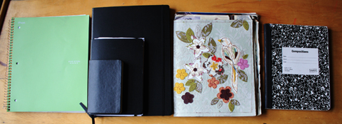
my current set of notebooks from the practical to the private

One or two notebooks is never enough which is a headache when packing. It seems at that any point even while traveling, I need at least two notebooks (three is preferable) to fulfill the range of desires and responsibilities in my life.

purely practical
The Five-Stars’ spiral bound college rule notebook with a plastic cover is my favorite for standard lecture classes. The lines are not too dark or light and the plastic withstands shoving into the backpack well.

everyday
My set of Moleskines and Lechtturm1917s are my most used and expensive notebooks. I wish every one of their pages was composed like a work of art with drawings and ideas, but no matter how hard I try, they always end up a jumble of bad sketches, to-do lists, random thoughts, list of library book call numbers, drafts of thank you notes, sketch maps when I go somewhere new, class notes when I forget the spiral notebook. Each size serves a slightly different purpose: large for thesis, medium for most things, small for when it’s more convenient.

My loyalty these black notebooks is not pretentious, it’s practical. The beauty of the Moleskines and Lechtturms is not the black cover, but the milky smoothness of their off white paper. In comparison, writing on most other notebooks feels like dragging your pen across sandpaper.

indulgent
One of my favorite notebooks I’ve received as a gift (from Hannah!) has birds and flowers sewn on the cover and thin plain pages on the inside. It has become a place to collage my four pound collection of magazine cutouts and even heavier archive of NYTimes style magazines. Even though I collect images obsessively, I hate that they usually just sit there in a large pile passively gathering dust. It always feels important to me to process what I cut out and create something new from it or try to synthesize it in some way or else it just become a pile of collected junk which is a useless. This is the only notebook where I have any success in composing the contents. Sadly, I don’t do it enough. It was last updated in August 2009.

self
“The journal is a vehicle for my sense of selfhood. It represents me as emotionally and spiritually independent. Therefore (alas) it does not simply record my actual, daily life but rather — in many cases — offers an alternative to it. There is often a contradiction between the meaning of our actions toward a person and what we say we feel toward that person in a journal. But this does not mean that what we do is shallow, and only what we confess to ourselves is deep.” – Susan Sontag in her published journals

Compositions notebooks have been my journals since third grade. It’s the thing in my life, along with collecting magazine cutouts, I have been the most consistent about. The pattern on composition notebooks begs to be covered by cutout images, so the two go hand in hand. (If I were still playing piano that would have beat out both, but oh well.)

I write in it sometimes consistently, sometimes sporadically. While it is the most unfiltered version of self, it is probably the least interesting notebook to anyone else. For one, I don’t write nearly as well or profoundly as Sontag. What is there is too circular, convoluted, and sloppy to be worth it to read even for me years later.

yet to have
Le Maxi. Square. A nice shade of blue. Good thickness. Maybe this will be the one where everything is beautiful.

alexander mcqueen

I was always aware of Alexander McQueen reputation as an extraordinary designer, but for some reason his collections were always on the periphery of what I looked at closely during fashion week. Revisiting his women’s collections today season by season starting 2001 (the earliest available on style.com) has been fascinating, mind-blowing, shocking.

The sheer volume of production is incredible. Compared to the usual 30 some looks that most designers send down the runway, McQueen’s 40-50 looks per season seems completely mad. How does one even have time to think when there is this level of production twice a year? And this is in addition to his work for Givenchy and resort and pre-fall collections.

I am equally astounded by his understanding and imagination of woman and their bodies. He loves the hourglass figure and is not shy about accentuating, exaggerating and admiring it. Clothes that accentuate the hourglass silhouette especially with a belt usually look typical and tired, but McQueen manages to create the hourglass with a level of toughness, never dainty. With him, the hourglass silhouette is empowering rather than stereotypical or overly idealized. I can’t identify how he does it and why others can’t replicate it.

The hourglass is never the same with McQueen. Pictures from style.com

The list goes on. Insane detail, incredible volume, pure creativity in presentation, referencing the past but never repeating it, ability to create unexpected textures.

Detail, volume, the austere and the extravagant. Pictures from style.com

When it came to textures and materials, I particularly appreciate what McQueen did with furs (or faux-furs?). He always manipulated them such they were not just a puff of material to get lost in. Or rather he does not just let fur speak for itself, he fashioned the fur to convey what he wanted.

Pictures from style.com

Truly beautiful work.

it’s better if you put it on wheels

The mission for this January was a furniture design/build. Considering how damn cold it is in to work in a garage in Western Massachusetts during January, I think plenty was accomplished.

Project 1: Mechanic’s Workstation
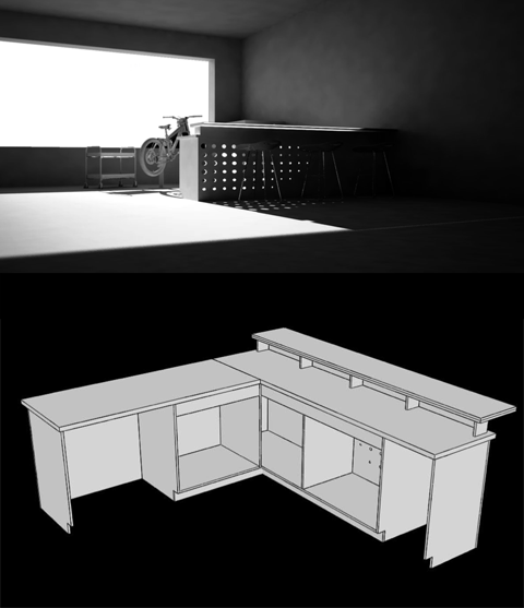
The proposal was a redesign of the storage system and the work surfaces. The storage system consists of two carts, one for heavily used tools which could be wheeled around the work area easily and another for storage of less commonly used ones. Both fit into bays under the work surfaces. To take advantage of the flood of daylight in the industrial loft space, we designed a panel with a gradient of circle perforations (dimensions were based on manufactured hole saws). Specified materials were birch plywood and 2×4 lumber.

A rendering of the perforated panel (that was done by Robert) and the L-shaped bench design

Project 2: Architect’s Workstation
We took in consideration the needs of a 21st century architecture student: spaces for digital and physical work, storage for our multitude of design books, security for our ever increasing amount of electronics. Also, there are more traditional needs such as storage for T-squares, plots, oversized rulers, rolls of trace that are usually not accommodated by conventional furniture.

The design consists of three parts: digital cockpit (the main work surface has screen, laptop, book storage), electronics cartridge (a rolling cabinet for the computer, scanner, other electronics that can be taken home during vacations), and modeling station (a cart with a higher surface, fits a 18″x24″ cutting mat, storage for modeling tools and other oversized things)

We were never quite happy with the design and have not finished building it, but we will! The modeling station is not in any of these photos.

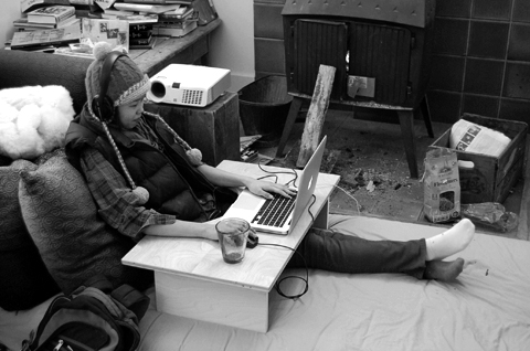
This is a separate piece of furniture that was previously made so that we could work wherever we wanted like next to the fireplace. Notice the circular cut out that the body fits into. We kept the cockpit idea for the larger desk as well. Also, I am not at the height of my fashion prowess here. We ran out of oil and it was cold!

The desk at the moment. Robert made the dramatic bookshelf sometime last year. The idea is to make a bunch of storage trays for the space below the shelf

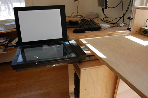
The cartridge has a pull out tray for the scanner. We zipped tied the scanner to the slide out portion.

Project 3:
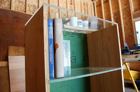
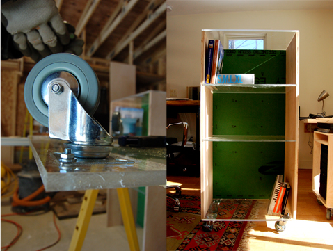
A lockable book shelf for Robert’s studio. I contributed to the design and none of the construction for this one. I demanded that all the horizontal surfaces be plexi and I think I was right. This is finished except for a plexiglass door. The green in the back is a scrap piece of zip wall.


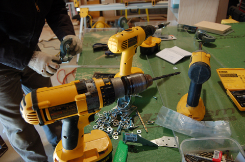
Bolting casters onto the bottom surface. It's more fun if it can be rolled around and much easier to transport, obviously.

54 collections later

This week in Paris a handful of designers showed their couture collections which showcase what is supposed to be the best and most extravagant masterpieces in fashion. They explore the fantastical, the ridiculous, the unimaginable. The techniques they employ are the most advanced and detailed oriented. It is in a different class entirely from the ready-to-wear collections during fashion week. To the untrained eye (that is me), the technique reveals itself through the extravagant details like beads, feathers, fur, ruffles but the aesthetics of the over-the-top usually turns me off couture. Like a lot of fashion, it’s a strange acquired taste.

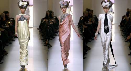
Karl Lagerfeld’s collection for Chanel this week is the first time I have been stunned by the beauty of couture and the first time I have appreciated Lagerfeld’s work for Chanel. Chanel’s fashion shows are hard to swallow because they are overdone with lace, bows, pearls in a sea of pastels. The gaudiness of ceiling height models of cake or purses distracts me from the clothes and I can only wonder why this decor and setting? But if you can get over all of that and just accept the pastels, the clothes are beautiful.

There have been many draped dresses, but few that ripple as elegantly and naturally as these from Chanel’s spring 2010 couture collection. The seams of the dress disappear and it looks as if fairies descended and draped the cloth on the models.

Dresses that flow like water. (Photos: style.com)

Cathy Horyn, the NYTimes fashion critic, wrote on her blog, ” Karl Lagerfeld said he had been thinking for awhile about how to do a seamless dress and only recently found a method that satisfied him. He said he thought this collection might be his most interesting in terms of technique. “It took me 54 collections to get there,” he said.”

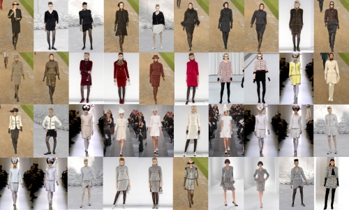
Also impressive is Lagerfeld’s innovation and creativity in working with the iconic classics of Chanel. The quilt, the tweed, the black dress, the suit. It is incredible that in Lagerfeld’s 27 years at Chanel, he has started almost every collection couture or ready-to-wear with a few new variations on the Chanel suit and in doing so, has kept the look contemporary and relevant.

Variations on the Chanel suit in Lagerfeld's couture collections from fall 2006 to spring 2010 (photos: style.com)

double jacket weather

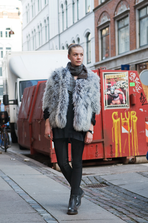
It seems that in the depths of freezing northeastern winter, when I am most in need of fashion advice, too many fashion blogs have traveled south leaving me to fend off the cold in clashing sweaters and multiple colored vests. The Sartorialist and Garance Dore are in Rio or Milan where highs are in the 40s which equivalent to spring in New England. For Zanita, it’s summer in Australia. Even those blogs located in cold countries like England and Denmark seem to be dressing for 50 degree weather. See below from Copenhagen Street Style.

That will keep you warm for 10 minutes max in a Copenhagen winter. There is no way I walk out in leggings or one layer pants in 20 degree weather. Please. Does being stylish mean that you have to look cold too? (via Copenhagen Street Style)

While I as still mastering the art of layering, a few people figured out a double jacket look that is badass and probably decently warm. When my friend Sarah came to visit me in Boston in November, she wore a tweed vintage Armani or Valentino fall coat (she also got this for under $40 on ebay) with a light velvet cinched at the waist jacket beneath. Her style decisions seem especially smart later in the night when I was huddling under a thin silk scarf because all I had worn beneath a down jacket was a short sleeve t-shirt.

I think it takes a certain amount of thoughtfulness and creativity to pull of the “double jacket”. It seems contrasting material and fit between the two jackets works aesthetically and is versatile because it gives two looks in one. At the same time, there are jackets that would never quite work. For example, most down jackets look so much like an outer shell that whatever you wear beneath is seen as separate outfit entirely.

While I have not found any inspiring double jacket combinations in my closet, I love idea because I can transform the things I wear in early fall/late spring/summer nights into something that has potential to keep me warm during dark Massachusetts winters. Some example below.

A bit more subtle. The inner and outer jackets drape off her body in a similar way which is nice. (via The Sartorialist)

Okay, so maybe she is not that warm, but she's not freezing either. Denim and leather is kind of obvious but it looks good. (via Stockholm Street Style)


Blog Stats

  • 15,803 hits